
Designing a website is harder than it first sounds. It doesn’t matter what your personal tastes are, what matters is whether the site will appeal to the right people. Some web designers fail to think about the user experience. You need to consider whether the user will find your site to be accessible. If the page is confusing, people will leave it. Some designers don’t realize this oh-so-simple fact. Here are seven mistakes that you had better avoid.
Web Design Issues for Web Masters
Design Issues
Here are 7 Web Design Issues, you should avoid to become a better web designer.
1. There are too many high definition graphics
Graphics can enhance your page, but they can also make the loading time slow. If you are using loads of different graphics, you might find that people have to wait longer than a minute for the site to load. The average user does not have that type of patience. If the page does not appear straight away, they will cancel it and go back to the search page. That is the last thing you want.
2. There are conflicting typefaces
The typeface or font that you use is super important. Most of the time, you should use sans serif fonts for online activity. When people are reading things on a computer screen or even a tablet, you need to make sure that it is legible. Serif fonts tend to have too many things going on, which means that they are confusing for readers. Ensure that you don’t use loads of different styles of font, or you could have serious problems.
3. The site is not responsive
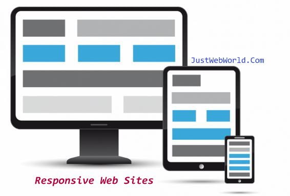
Responsive Websites
Responsive sites offer the best experience to users. These days, people do much of the internet browsing on their smartphones. If your site looks incredible on a 15-inch screen, that might not translate to a phone screen. You should ensure the site you create is 100% responsive, meaning that it adapts to the device on which you view it.
4. The site doesn’t suit your subject matter
When a user opens your page, they should immediately understand what the site’s purpose is. The design of the site should suit whatever the subject of the site is. For example, beautiful church websites will not look the same as a fashion retail site. A church website would look serious and chic whereas a fashion site can be colorful and edgy. It is crucial that you consider what the site is about before you start creating the design.
5. There is loud audio on the site

Loud audio on the site
Sometimes, people think that it is a great idea to have audio on a page. It is not. You have no idea where people will be when they view your site. They might be at work or in a library. When people hear a loud audio track, their natural instinct is to close the page, and so that is what they will do. Leave it out.
6. The welcome page is boring
Sometimes, websites have welcome pages before people get to the main site. It is worth noting that these pages are pointless, but if you do use one, you should make sure that it is interesting. There is nothing worse than a page that just says ‘Welcome to our site.’ This technique is old hat, and so you should avoid this web design issue.
7. There are too many images

Too many images
Designers love images, which is why they tend to overdo it sometimes. If you can do so, you should avoid using too much imagery on your site. Make sure that every picture you use has a point. Don’t just put loads of photos on the site and hope for the best. Use impressive photographs but ensure that you are careful with them.
It is only natural that you will make some of these web design mistakes. Now that you know what design issues to avoid, you can start your journey towards being a better web designer.


