
Why Web Designers Should Care About Typography?
Typography is traditionally the aesthetic style and general appearance of printed material, although in the last couple of decades, this has been expanded to include digital media, which of course, isn’t technically printed. Typography is vital to web design, setting the overall tone for the site and informing the users experience, whether positive or negative. The London based The Guardian newspaper recently speculated that typography might be about to undergo a change, particularly in typeface, now that the founder of the Helvetica font has passed away. “Speculated” is perhaps the key word here, since major brands such as Nestle, Lufthansa, Toyota, American Airlines, American Apparel and The Gap are unlikely to overhaul their web based and physical typography simply because the man who developed them is no longer with is. But why is typography so important, and why do Web Designers need to care?

Why Web Designers Should Care About Typography?
Check out 10 Reasons Why Web Designers Should Care About Typography?
1. Break Up the Text:
Attention spans are perhaps even shorter in an online environment, and the rest of the Internet, with its illegal downloads and flash games are just a click away. Avoid large blocks of text – cull them if possible, but otherwise segment them or break them up with visual imagery.
2. Be Careful with the Font:
Ideally, the main font for the site should be line with the website owners corporate branding, although not necessarily the same – the entirety of the American Airlines website isn’t written in Helvetica. Limit yourself to two different fonts – three if absolutely necessary. More than one font allows differentiation, but too many fonts can be distracting.
3. A Font Chain of Command:
As mentioned, using two fonts allows differentiation, but this differentiation can also be utilized to strengthen one type of font over the other. Use one for headers, special offers, etc, and the other for general text. This actually also makes it easier for the reader.
4. Lost in Space:
The boundaries of a webpage are almost infinite, and while you might want to condense a message for the sake of clarity, don’t bunch the text together too much. It’s not like a newspaper page when you can run out of space.
See Also: 8 Tips for Improving Your Web Design
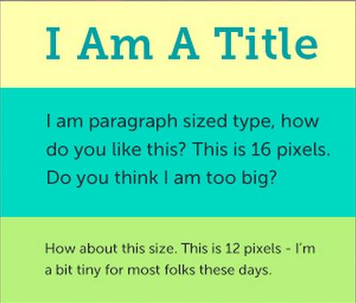
5. Size of Font:
Consider that you have readers of many different visual capacities, and so you need to construct a typography that serves the largest number of people possible, while still remaining within your stylistic plans. 16 pixels are generally considered to be the most effective size.
6. Line Spacing:
Don’t drown users in space, and yet don’t clutter your text together. 1.5 to 2.0 line spacing is ideal – and this is actually standard when submitting assignments at many colleges and universities, as well as when sending a manuscript to a publisher. It’s also the best option for web typography.
7. Color of Font Vs. Color of Background:
You would think this is logical, and yet so many websites make the mistake of light font on a light background and dark font on a dark background. There doesn’t need to be a bold contrast, but the color of the font needs to complement the color of the background on which is appears.
8. Avoid the Middle:
Be wary of aligning all text in the center of the page. Strangely enough, many websites do just this, despite our natural inclination to read from left to right.
See Also: Ten Important Tips for Designing the About Us Page
9. Kerning:
Kerning relates to the spacing between characters of a proportional typeface, since with many websites, this is not always achieved electronically, and must sometimes be done manually. Kerning is necessary to achieve a polished look, but it’s not particularly difficult to achieve.
10. Copyright:
Be careful about the typeface you end up using, since depending on your location and/or the registered location of the website you’re designing for; the typeface might be copyrighted, meaning there’s a potential for infringement. The regulations pertaining to typeface copyright vary from country to country, so be sure to check.
So, Here we are discussed about 10 Reasons Why Web Designers Should Care About Typography, If you have any questions you can free to ask by commenting below.


